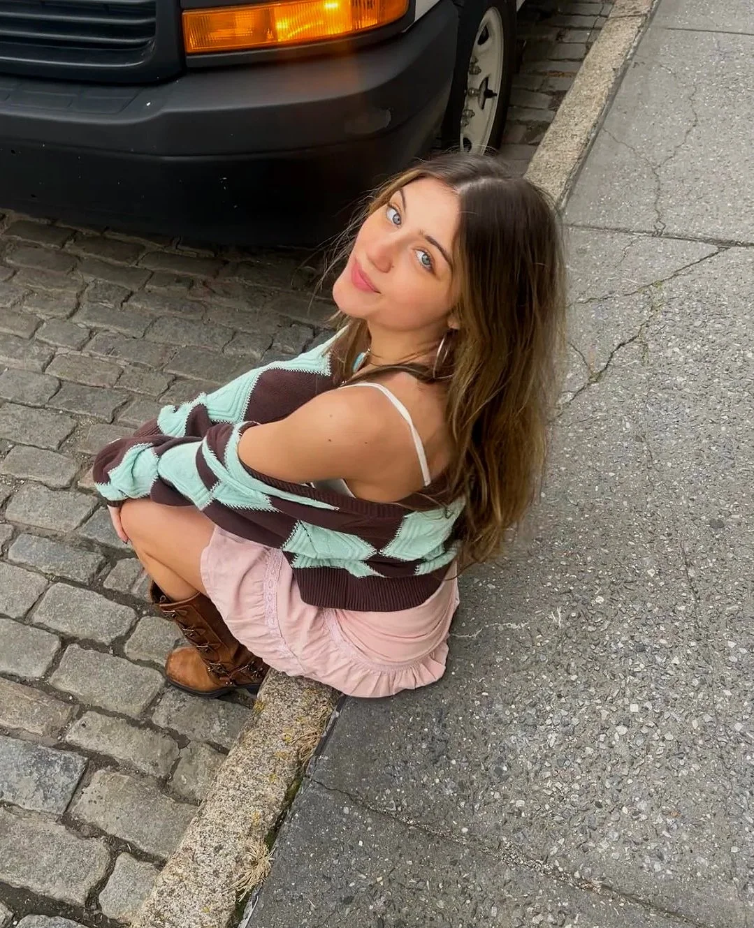
My name is Katie Herskowitz, and I am a second-year student at the Parsons School of Design, majoring in Communication Design. My passion and background are in photography, filmmaking, marketing, and graphic design. I am constantly searching for and creating visual works using everyday experiences, people, and places that naturally provoke emotion and create an immediate connection. I've been creating art since childhood, leading to greater responsibility as Editor-in-Chief of my High School yearbook and then joining the Parsons community. I want to view the world as a place where people’s creativity is recognized and appreciated. My goal is to be a creative director, and I hope that one day, my work will inspire other young designers to be true to themselves.

MY PORTFOLIO

Developed podcast idea and designed visuals to promote the show on social media platforms. I grew up listening to and watching podcasts because I enjoyed hearing what other people had to say and their thoughts and ideas on various topics. Now that they're more popular, I wanted to come up with an idea for a podcast that both myself and my peers, as well as other podcast listeners, would enjoy. This podcast could be both critical and not too serious, allowing listeners to create a connection and find themselves in it.

Est. 2021

Merch idea for podcast

A book about Rock and Roll using mostly typographic elements.  I created the complete concept of this book, including the front and back cover. I wanted this book to feel like "Rock and Roll." I made all of the typefaces intense, bitmapped, and half-toned photos to represent how this genre of music feels to me accurately. I also decided to make the text pages look funky and unorganized, as that's what rock music can feel like. This is a video version of my book. My actual book is currently being printed.

Typography poster design based off Mac Millers song “ladders” I decided to do a replica of my first black and white design and create two identical posters but in blue because to me this song makes the sky feel a bit brighter.

Football Championship Magazine Spread. I wanted this design to stand out, which the championship belt and image do. I chose to make the visuals look like game pieces and extremely technology-based because, as an outsider to sports, it is not only a physical game but also a mental game that you must puzzle piece together, which is what these images represent.

This was designed for my first college assignment. The instructions were to design an item of apparel that reflected your model's alter-ego. But I didn't want this to be simply another assignment. I wanted to truly capture my model's alter ego and give her confidence in how I represented this side of her. I designed the top and bow tie and then developed a magazine page with the interview and final images.

Promotional graphic for local thrift market. This was used to create a social media post. I wanted to develop something that stood out and was different from what Instagram followers had seen before for a thrift market. I made the type very bold and utilized yellow to make it stand out. Thrifting and sustainable fashion are very important, so being asked to create this graphic meant a lot to me.